Yuri Vishnevsky has published a series of posts in Observable as a Notebook on Density Plots.
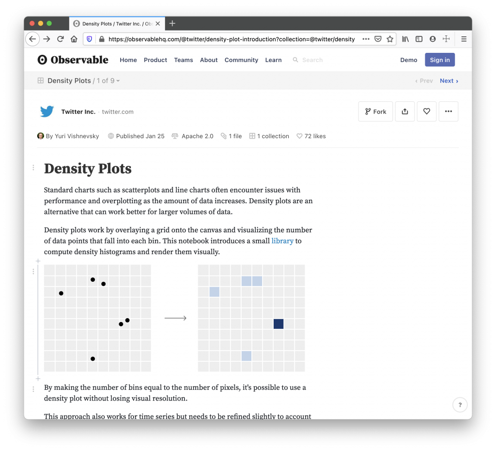
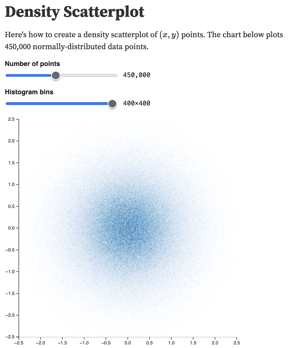
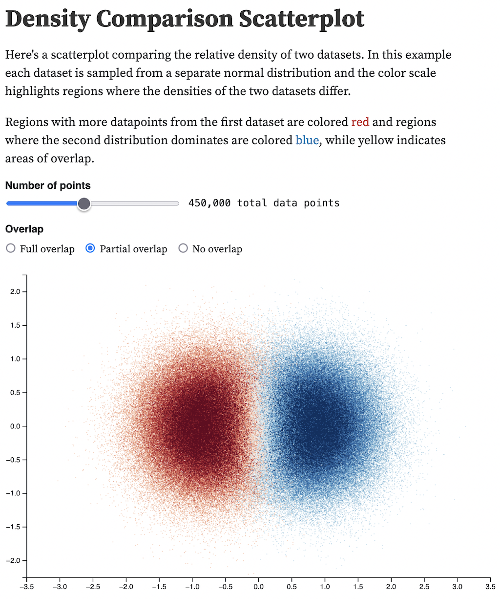
Density Plots are standard charts similar to scatterplots and line charts that are used as an alternative to visualise information when working with large volumes of data.
Density plots work by overlaying a grid onto the canvas and visualizing the number of data points that fall into each bin. This notebook introduces a small library to compute density histograms and render them visually.
Standard charts such as line charts have difficulties scaling as data increases due to issues with performance and overplotting. Density plots are an alternative that handles larger volumes of data.