Wired has written another post on Google’s Material Design, this time looking at the considerations within Interaction Design.
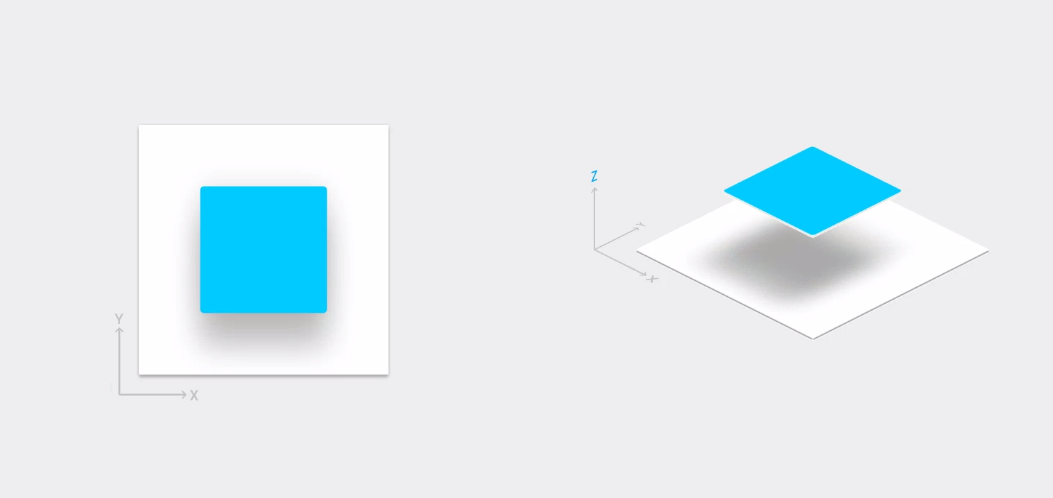
Material design is a few things. It’s a makeover—a “sweeping, well-reasoned, and often beautiful redesign” as we said earlier this year. It’s a new way of understanding user interfaces, in which UI elements get stacked like physical objects in three-dimensional space.
It’s a bid to unify … products across platforms and devices, a modular design language built to scale across not just phones and tablets but also watches, walls, whats-its, and wherever else Google might end up in years to come.
… Material design shaped the OS in some more foundational ways. One of the biggest is a new approach to UI … every interface is a three-dimensional construction, with each component behaving as if it was made out of real, physical material.
Examples include:
Picker components for picking date and time
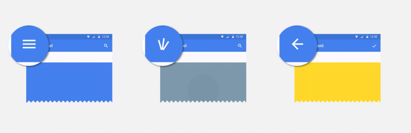
Navigation drawer
Navigational transitions
Scrolling techniques
Swipe to refresh
Date & time formats
Some of the principles and Metaphors, Intention and Meanings are shared within delightful details being considered for Transitions. The Material design website also has a nice introduction to the new visual language of Material.