Lex Fridman has interviewed the team at Neuralink and discuss technology, design & modelling challenges of creating a natural & intuitive brain-computer interface (BCI) experience. This podcast goes deep behind the scenes at Neuralink with discussions that goes back to the core of User Experience such as discussions on feedback loops, model integrations, probabilistic metrics, consistency actions, prompts & behavioral psychology.
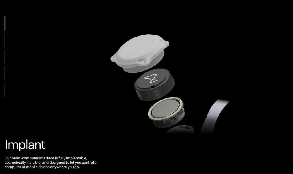
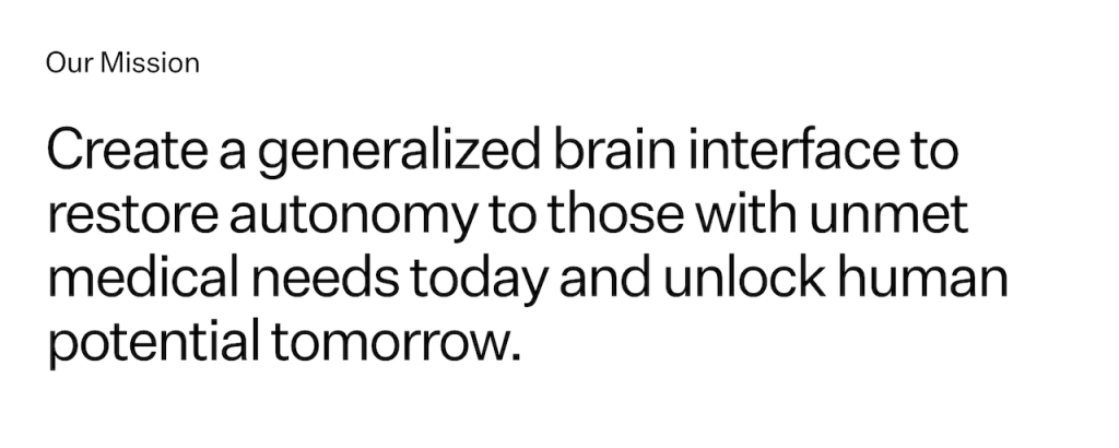
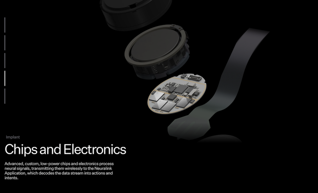
Neuralink is a neurotechnology company founded by Elon Musk with the ambitious goal of developing advanced brain-computer interfaces (BCIs) to enhance human cognition and address neurological disorders. The company’s primary focus is on creating cutting-edge implantable devices that can seamlessly connect the human brain with external digital systems.
As UX, Design & many other disciplines merges with AI, LLM’s, new Tools and Computation Design, there is a clear shift to how we design, and the processes we use – a reflection to how our industry is shifting in only 2-3 years.
This incredible set of x5 interviews by Lex Fridman covers the ambitious steps of developing advanced BCI’s to enhance human cognition and achieve the Neuralink aim to address neurological disorders.
- Elon Musk, CEO of Neuralink, SpaceX, Tesla, xAI, and CTO of X
- DJ Seo, COO & President of Neuralink
- Matthew McDougall, Head Neurosurgeon at Neuralink
- Bliss Chapman, Brain Interface Software Lead at Neuralink
- Noland Arbaugh, the first human to have a Neuralink device implanted in his brain
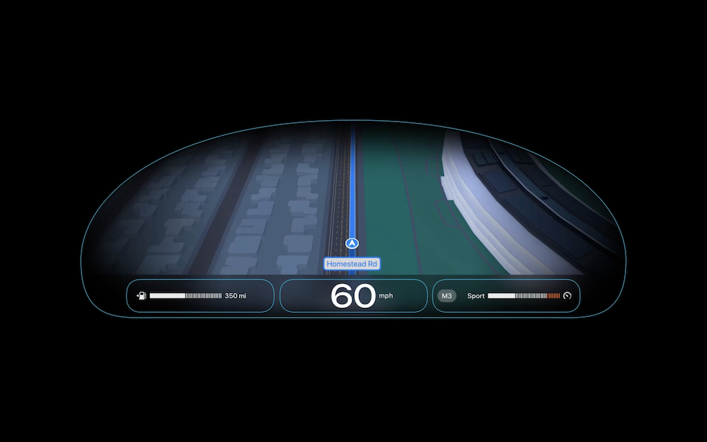
Although the podcast is very broad covering neuroscience, the human brain, surgery, implants, UI, cognition and technology, it was discussions on UX, Design and AI that was intriguing. The design for different human intentions & actions, interfaces and ways of reducing frictions through innovative technology and design was refreshing.
The Bliss Chapman interview, who is Neuralink’s Brain Interface Software Lead is a masterclass discussion on User Experience Design – the tip of the iceberg of topics today’s designers must focus on.
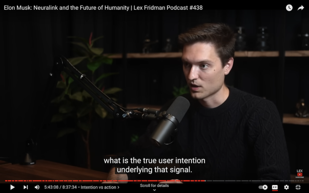
If you are interested in UX, Design and Technology, you will find what Bliss Chapman and Lex Fridman discuss incredibly eye-opening – especially how UX today merges with Machine learning Models, Control strategies, Closed vs. Open Feedback loops, Smoothing/Friction Biases and how Latency can be used as a cost metric in User Experience Design.
Bliss Chapman interview chapters:
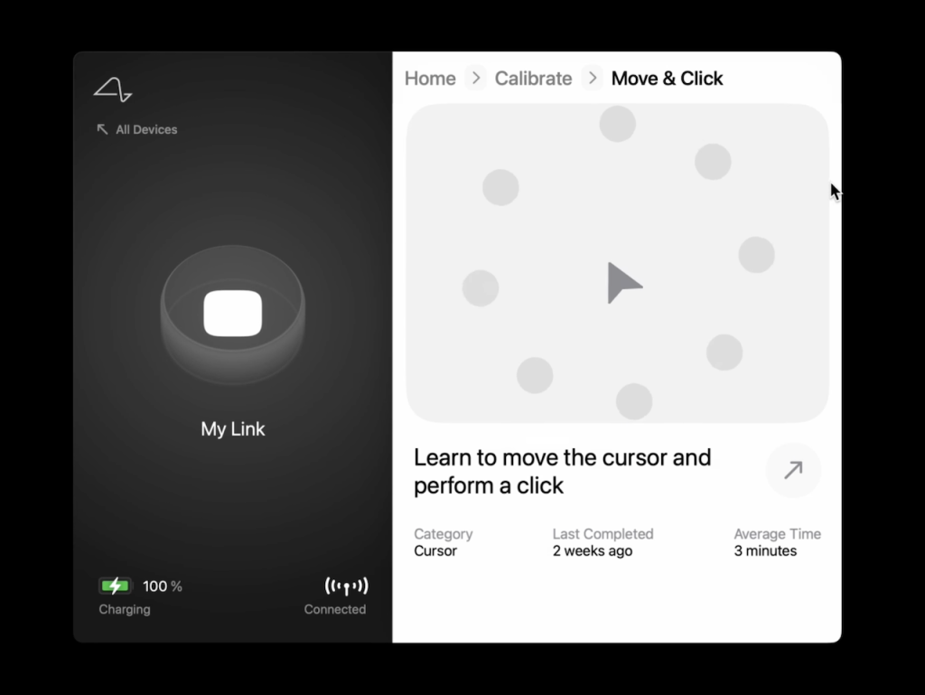
5:06:11 – Bliss Chapman 5:19:27 – Neural signal 5:26:19 – Latency 5:30:59 – Neuralink app 5:35:40 – Intention vs action 5:46:54 – Calibration 5:56:26 – Webgrid 6:19:28 – Neural decoder 6:40:03 – Future improvements.
Below are some quotes:
05:49:28 – Bias Correction
On Bias Correction … and it turns out that that’s one of the first qualia of the cursor control experience that’s impacted by neuron. Quality of the cursor experience – It’s very poetic. I love it.
The quality of the cursor experience.
Yeah, I mean it sounds poetic, but it is deeply true. There is an experience. When it works well, it is a joyful… A really pleasant experience. And when it doesn’t work well, it’s a very frustrating experience. That’s actually the art of UX, you have the possibility to frustrate people, or the possibility to give them joy.
05:52:17 – Brain Laws of UX
on Brain Laws of UX … I think we’re in the early stages of discovering those laws, so I wouldn’t claim to have solved that problem yet, but there’s definitely some things we’ve learned that make it easier for the user to get stuff done. And it’s pretty straightforward when you verbalize it, but it takes a while to actually get to that point, when you’re in the process of debugging the stuff in the trenches.
05:53:14 – Assigning costs to every action (when an error occurs)
On using a cost metric … So there’s different sort of cost functions associated with errors in this space, and part of the UX design is understanding how to build a solution that is, when it’s wrong, still useful to the end user.
It’s so fascinating, assigning cost to every action when an error occurs. So every action, if an error occurs, has a certain cost, and incorporating that into how you interpret the intention, mapping it to the action is really important. I didn’t quite, until you said it, realize there’s a cost to sending the text early. It’s a very expensive cost.
06:10:10 – UX cannot just be solved iteratively, you need to step back & think globally
UX is not something that you can always solve by just constant iterating on different things. Sometimes you really need to step back and think globally, “Am I even in the right sort of minima to be chasing down for a solution?” There’s a lot of problems in which sort of fast iteration cycle is the predictor of how successful you’ll be… But UX is not that way, I mean, users are actually quite often wrong about what the right solution is, and it requires a deep understanding of the technical system, and what’s possible, combined with what the problem is you’re trying to solve. Not just how the user expressed it, but what the true underlying problem is to actually get to the right place.
The Full Transcript of the Lex Fridman Podcast #438.